ROCK-A-FIELD | Open air Festival
ROCK-A-FIELD
The sleeping fox catches no bands
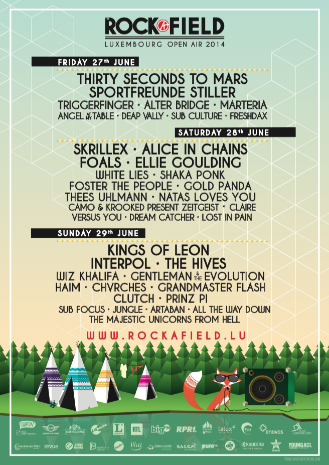
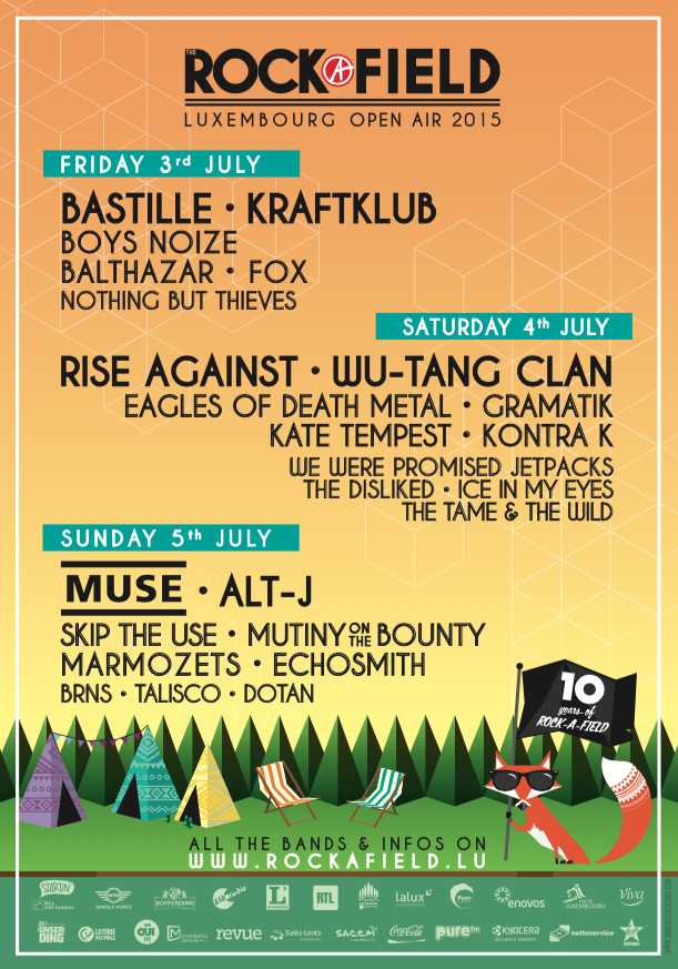
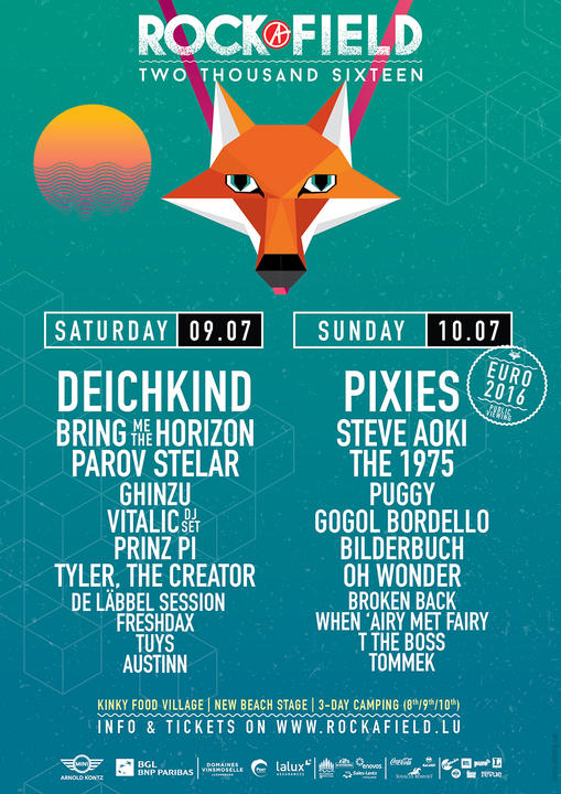
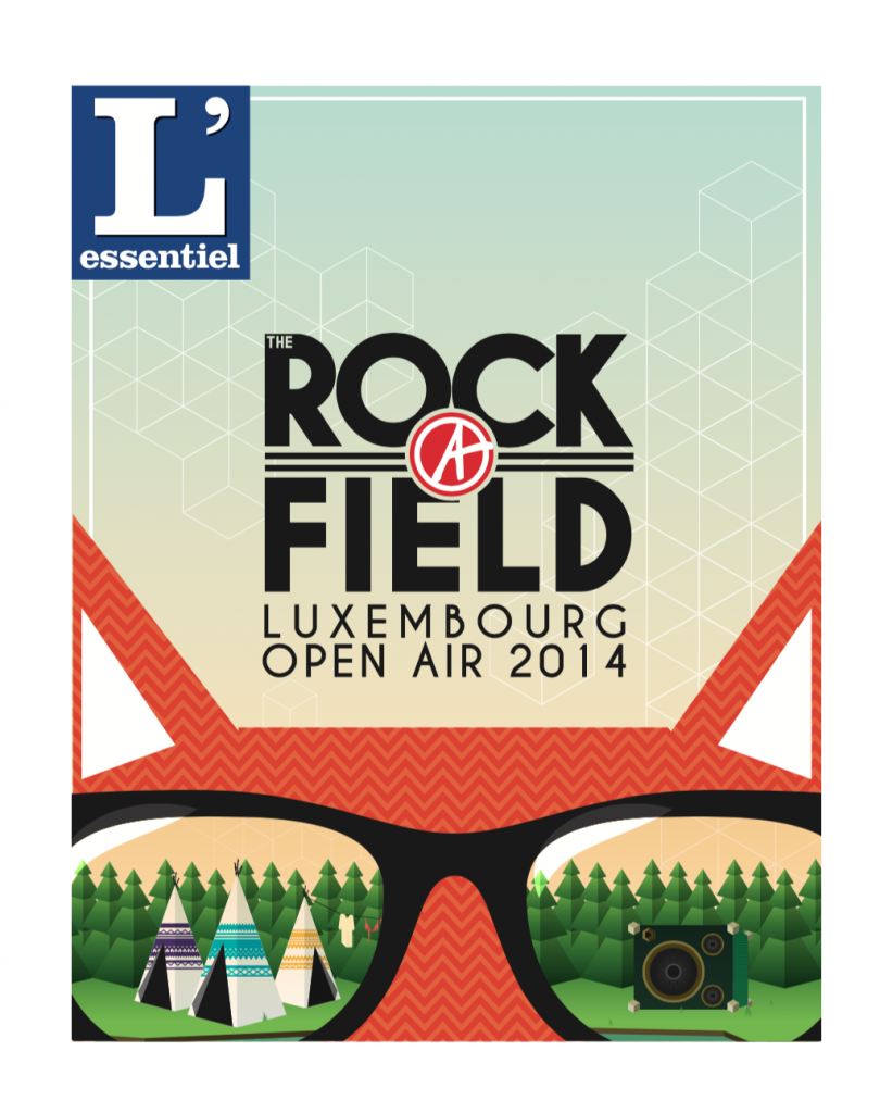
Rock-A-Field is/was Luxembourg’s biggest open-air music festival, featuring both international and local acts, including some pretty big names like Skrillex, Kings of Leon, Muse, Queens of the Stone Age, etc…and has evolved from a one day festival to a 3-day event for its last few editions. I was asked by Den Atelier (a pretty big concert venue in Luxembourg and the organiser of the festival) to do the 2014, 2015 and 2016 editions (so three last ones to date), which was a huge challenge, but also a huge honor for me, as it’s usually the kind of project that will go to an agency, due to the workload and high profile nature of the project.
The brief was pretty open, but there were a couple of constraints to respect, as with any project. The first task was of course to rework the logo. We went for something a bit more simple that would be adaptable to different designs, in order to establish a more fixed branding for the festival, as the years before used a more tailor-made approach to the logo and visual.
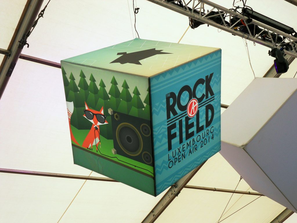
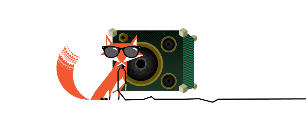
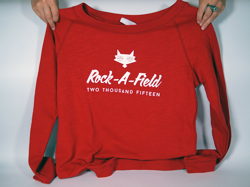
My main input was to create a mascot for the festival, that could be used on promotional material. The result is a red fox with tribal patterns in his tail and sunglasses. The fox as an animal has a strong link to luxembourgish culture through the fable “Den Renert” by Michel Rodange, so it was a perfect fit. The idea behind the fox was to have a concept, that could also be re-adapted in different manners for following editions. Once this was established, it was all a matter of condensing everything into posters, merch, website- and app-designs, wayfinding for the festival site, and other promotional material.
It was a fantastic project to work on. Intense, but just great to see everything come together, see merch with the fox design being sold out on the first day of the festival. It was kind of a playground for different ideas, some worked out, some didn’t, but all in all, getting asked to do the following two editions of the festival hopefully means that the client was satisfied with the result.
The Logo and the fox
Let’s start off with the final logo for the festival. It was adapted to a line and block version, depending on how it needed to be used.
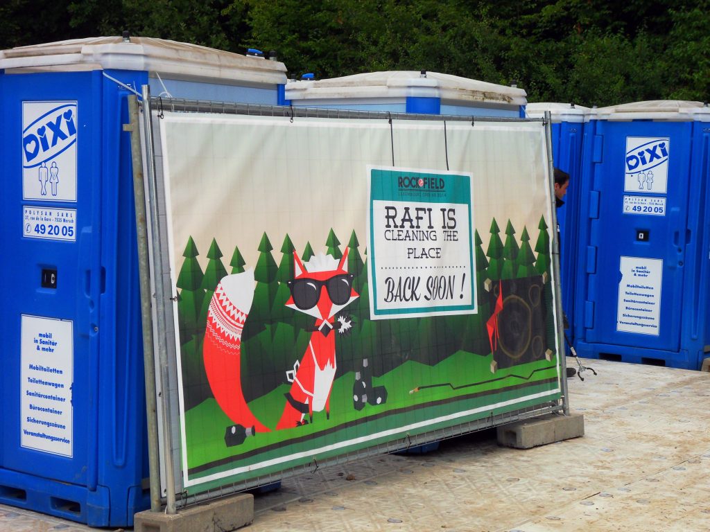
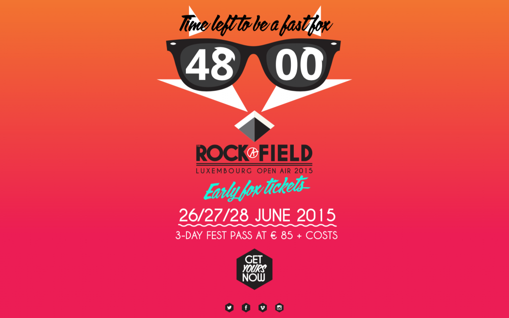
This version of the logo shows the first use of the fox, as a simple white silhouette. The concept was to have different iterations of the fox, one simple, graphic one, one illustrative but reduced one (the head, but in full color) and the complete fox illustration, if possible with background. We had some fun with the fox as well, adapting it to different situations, carrying a flag for the year edition of the festival, wearing a Santa hat for a Christmas promo on the website, or wearing a maid’s outfit on the “cleaning in process” signage at the festival. The illustration was also, for the 2014 and 2015 editions an integral part of the poster. In my honest opinion, 2014 was already a good run, but the concept really came together in 2015.
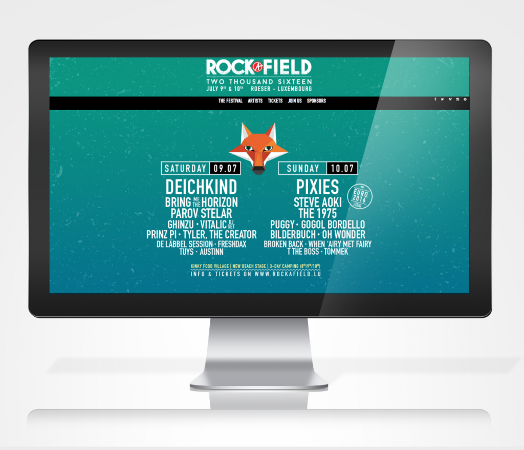
In 2016, we shook things up a bit so the idea wouldn’t become stale. The poster took on a more graphic and less illustrative approach, and so the fox was also changed to reflect the approach. We did however keep the foxhead silhouette as a graphic link.
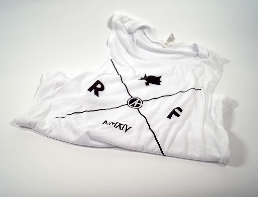
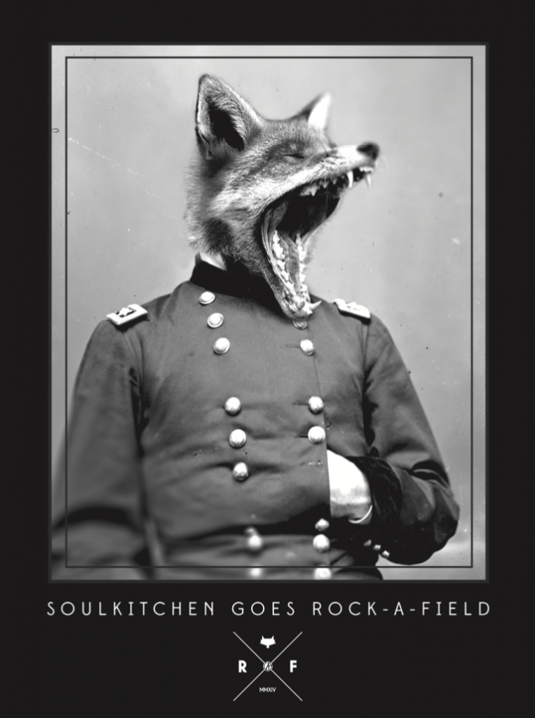
We also did a series of “hipster-style” logos, which could be used on merch and other more specific applications. In addition to this, the guys at Den Atelier really like the “Novus Ordo Seclorum” series I did and asked if I could adapt the idea into a special edition t-shirt for the festival. I was of course, more than happy to oblige.
Visual identity
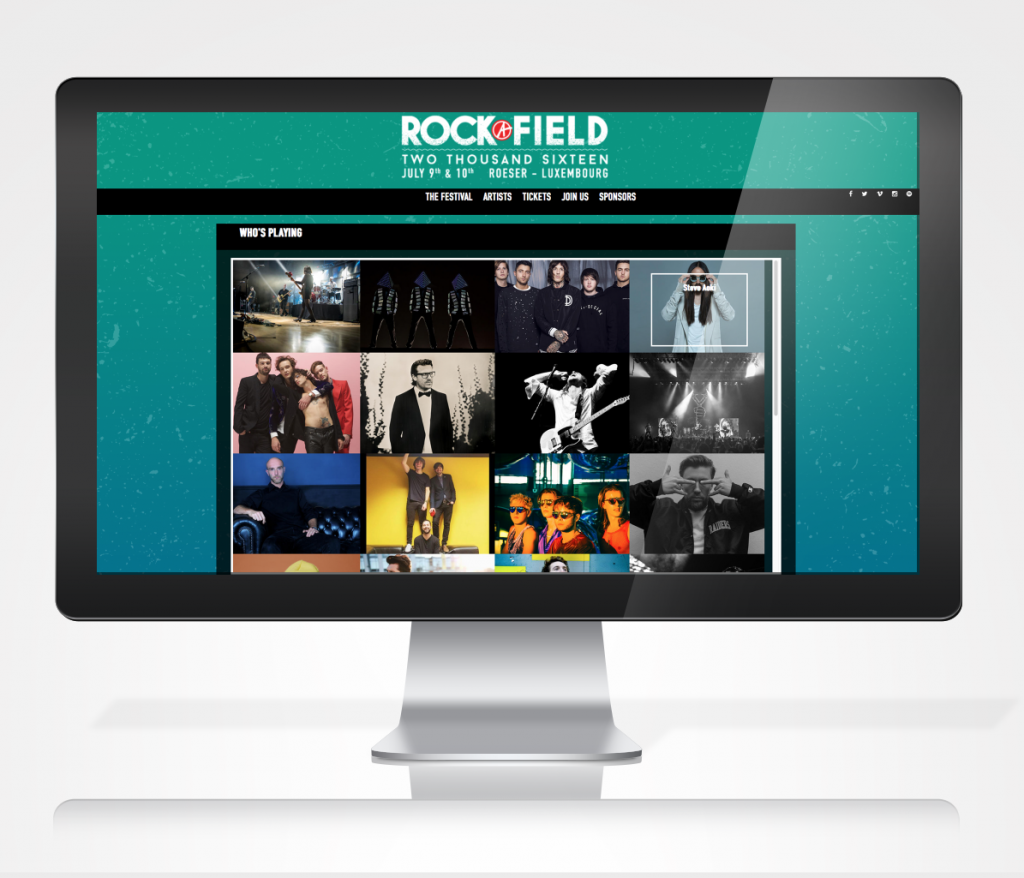
The visuals had to be adapted to a variety of different supports, which was definitely a challenge. Of course, there were all the different poster and print formats, from the standard hand-out flyer, to big scale billboards, over newspaper adverts etc. but one of the key elements was the website, as this was the main source of information for the public. I handled the design part, while the programming was handled internally. 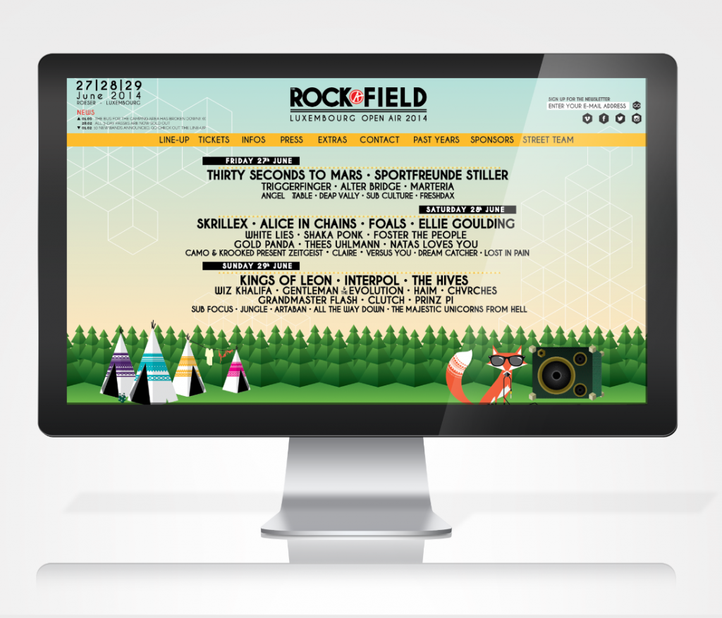
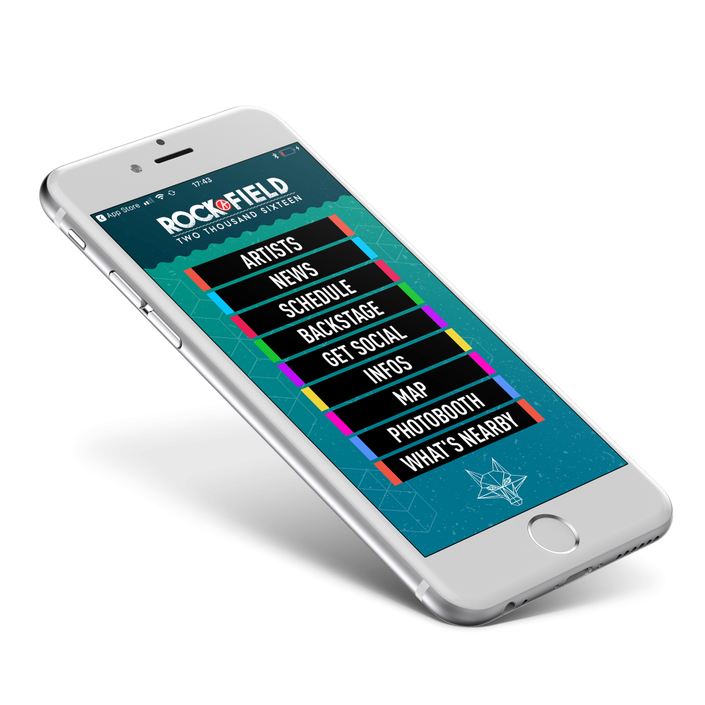
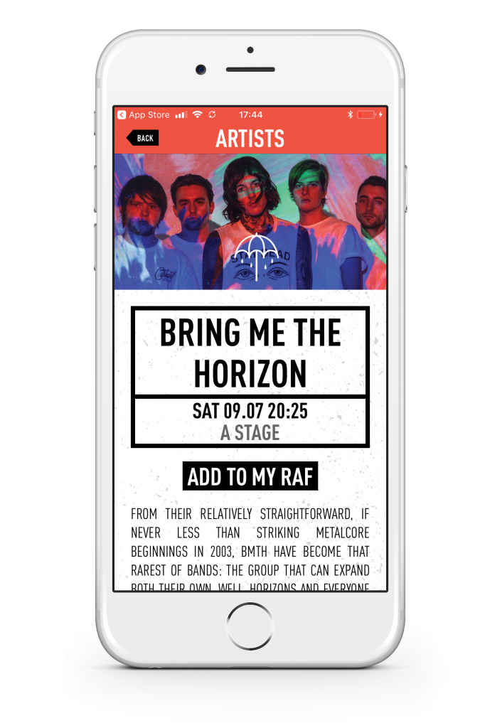
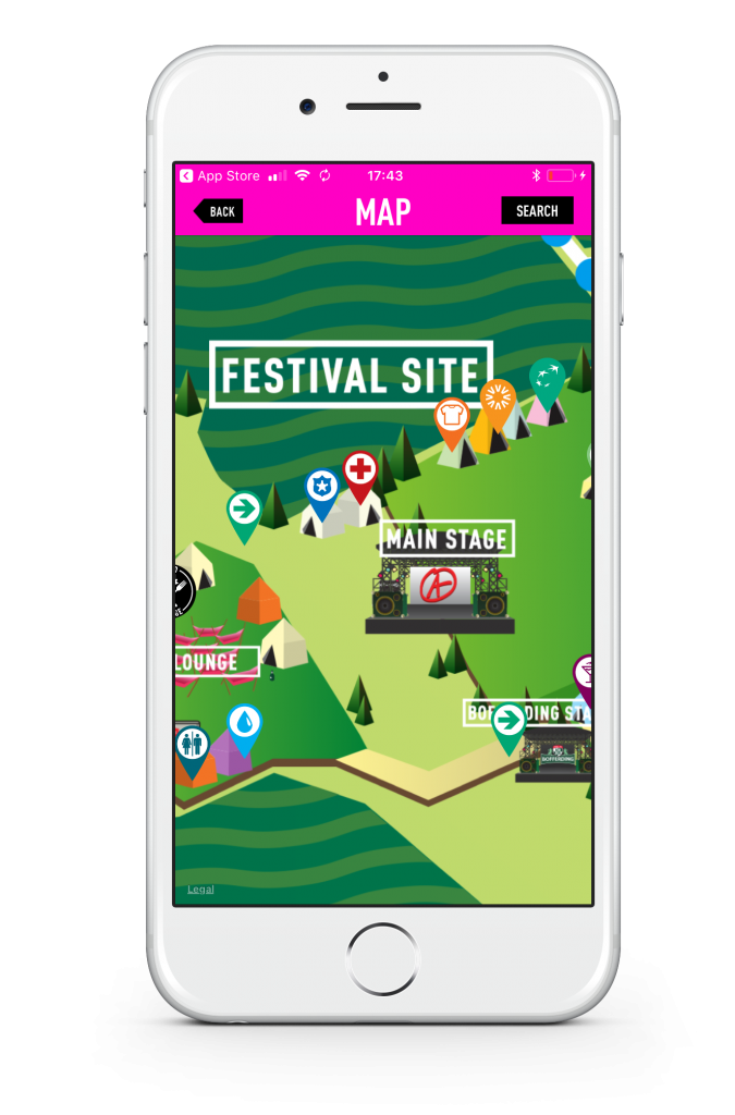
The biggest challenge for me, was to design the UI and UX for a mobile app. While the programming was, again handled by different team (at L’Essentiel, a major newspaper publisher in Luxembourg and partner of the festival), I had also never before worked on app-design, and as my editions were the first to feature app-integration, I also had no frame of reference. To be fully honest, at the beginning of it I was shitting bricks. But at the end of the day, athe app came together quite nicely. I did also learn quite a bit in the process.
Signage and other applications
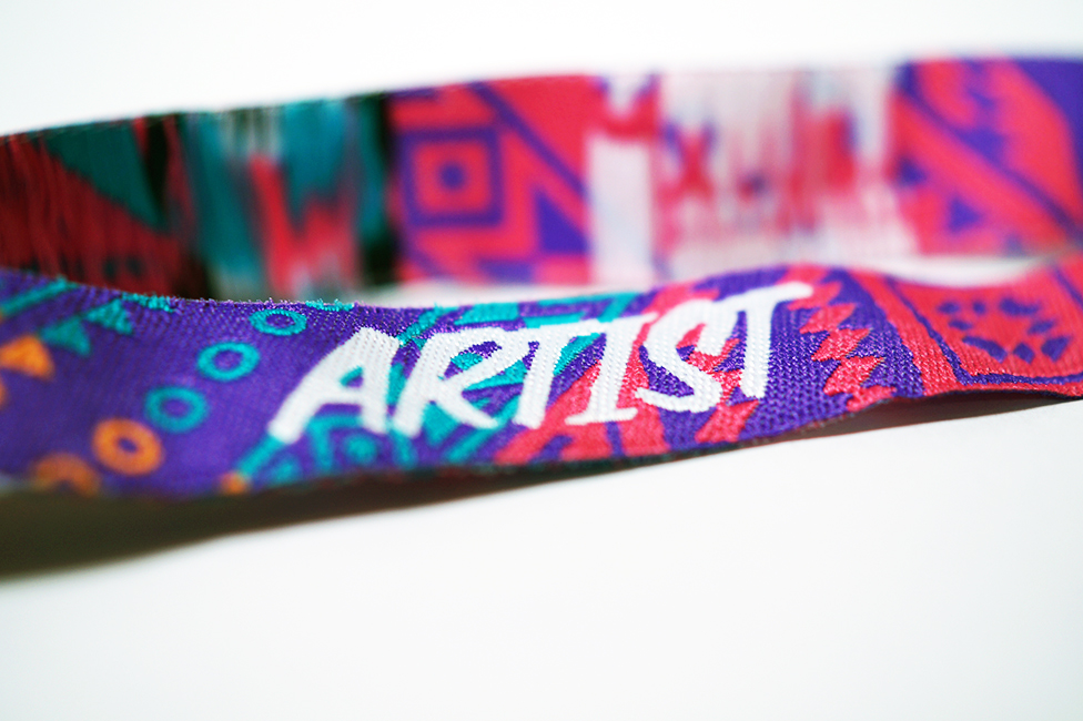
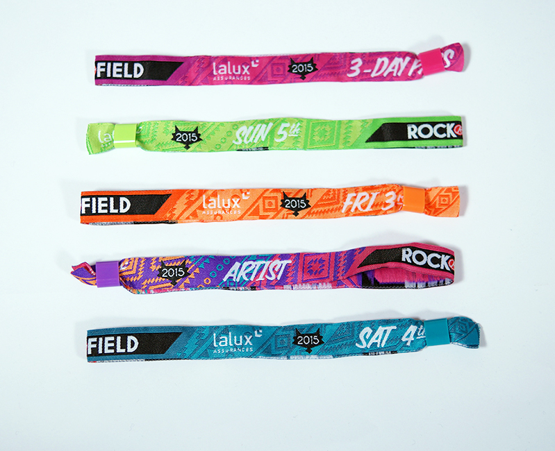
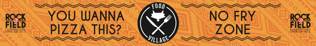
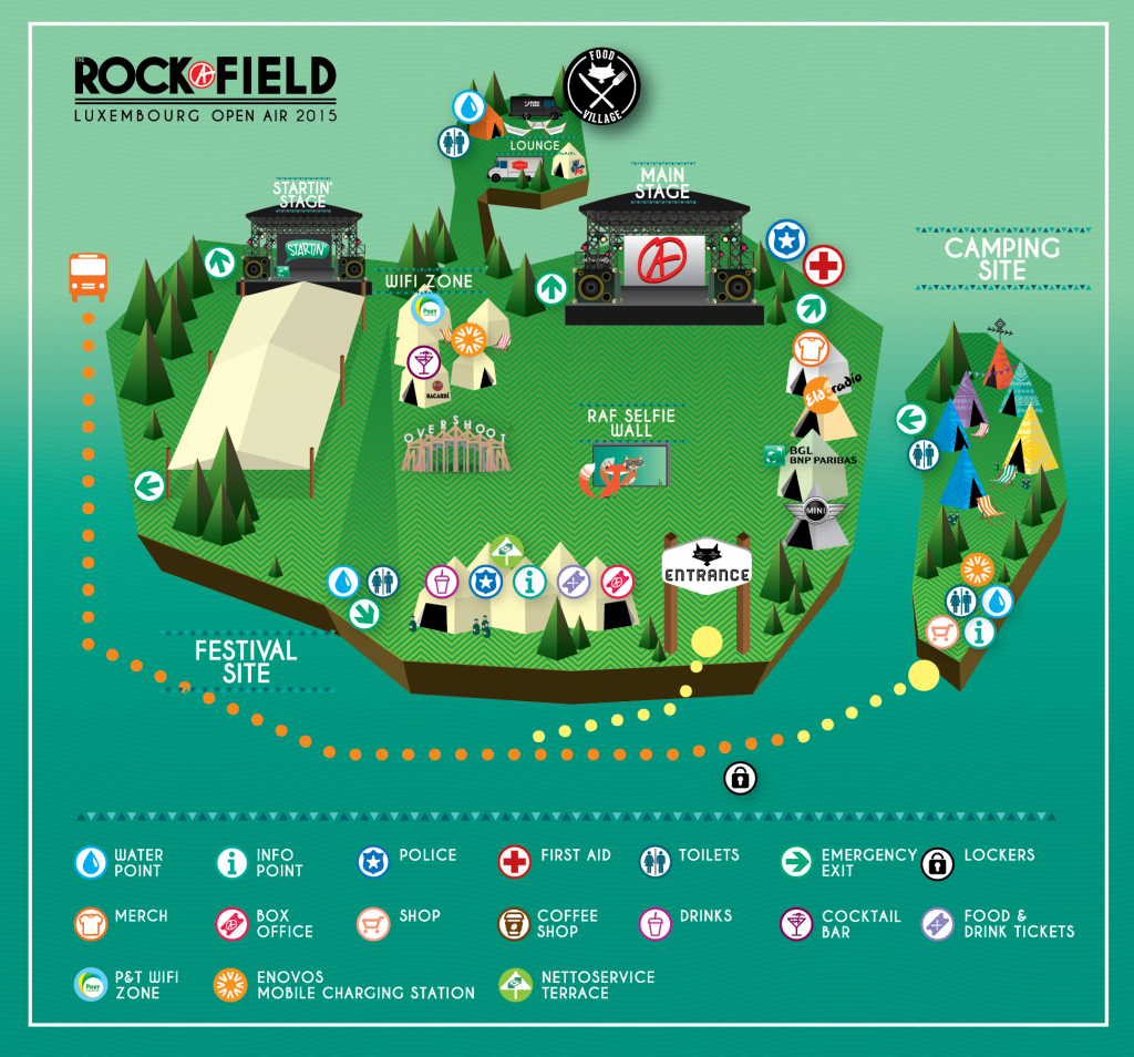
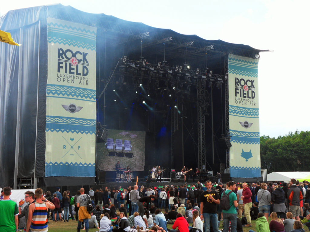
The final part of the project was to create the on-site signage for the festival. This was mainly readapted from the main visual, but some adaptations, like the food village banners (featuring little food-related-and-groan-inducing puns, or the stage banners. The wristbands for the crew and visitors were also quite a fun thing to design.